
Why one logo position matters on every vehicle
People see a vehicle for only a few seconds at the robots, in a parking lot, or heading out past the N1. That means the eye has to catch the logo quickly, and it needs to land in the same place every time. If one bakkie carries the logo on the driver door and the next has it on the rear quarter panel, the fleet starts to look like a collection of separate jobs instead of one business.
Consistent placement helps customers remember your name, your contact details and the type of service you offer. It also keeps your team looking organised. Whether the vehicle is doing deliveries in Paarl, site visits in Wellington, or moving between Stellenbosch and Franschhoek, the branding should tell the same story. That kind of repetition builds trust without shouting for attention.
How to set a repeatable layout for mixed vehicles
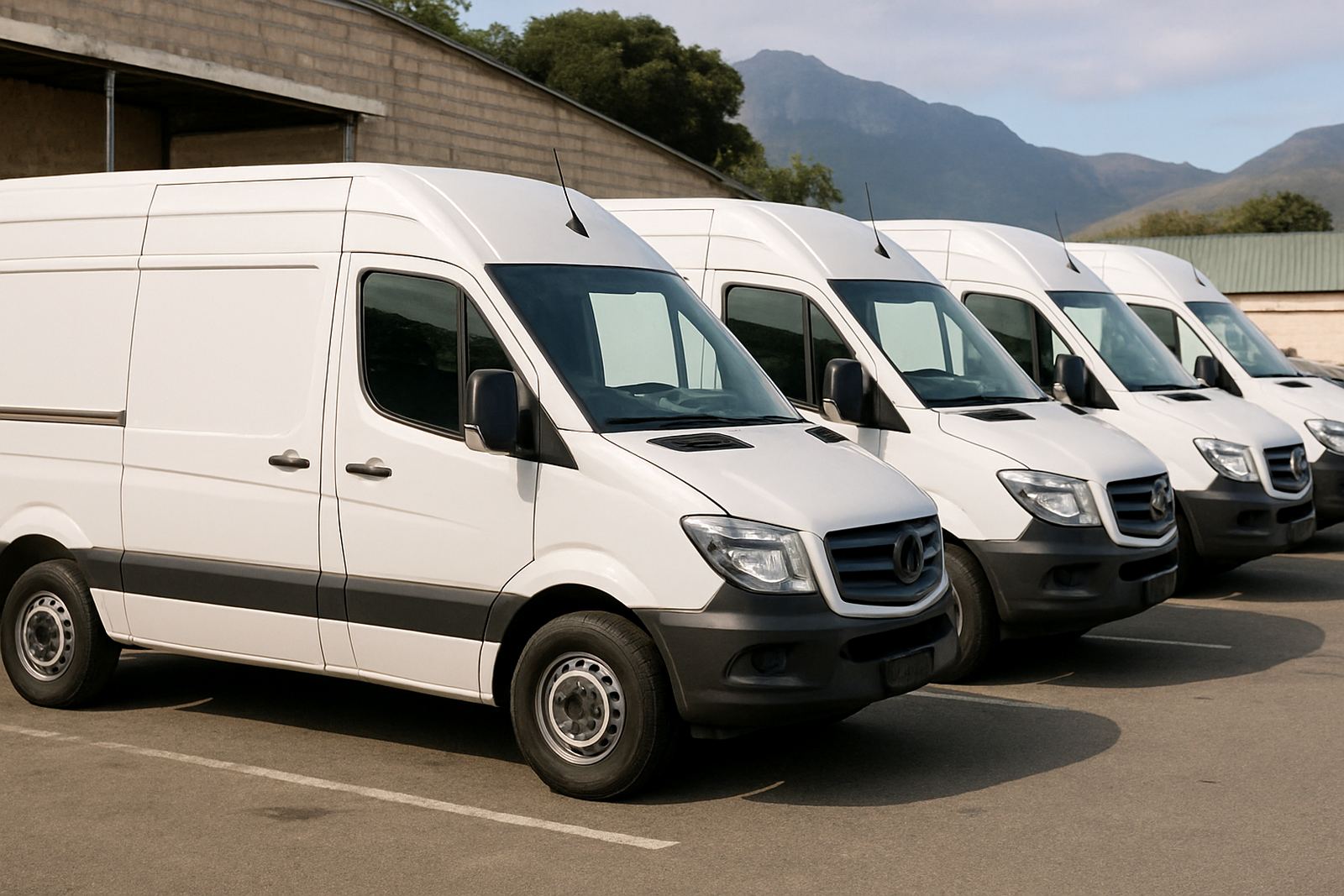
Most fleets in the Boland are not made up of identical vehicles. A company may have one half-ton bakkie, a smaller hatchback for sales calls, and a panel van for equipment. The trick is to create a layout system, not just a single artwork file. The logo, phone number, website, service list and safety markings should all have set positions that can be scaled up or down without losing balance.
A good layout plan usually starts with the most visible panels and works outward from there. That might mean the driver and passenger doors always carry the main logo, the rear carries the service list, and the tailgate or back doors carry contact details. If the layout is planned once and followed across the fleet, there is less guesswork later and fewer reprints.
- Keep the logo in the same relative position on each vehicle type.
- Use the same colour values across all wraps, decals and magnets.
- Match font sizes so contact details read the same from vehicle to vehicle.
- Leave enough clear space around the logo for curved panels and handles.
Matching branding to real working conditions
Fleet branding has to cope with dust, sun, road grime and constant washing. In Paarl and Wellington, vehicles spend a lot of time in bright sun, so colours can fade quicker if the material and laminate are not chosen well. Coastal humidity is less of a factor inland, but many businesses also run between the Cape Winelands and the West Coast, so the finish still needs to handle weather changes and long days on the road.
Consistency is not only about the logo position. It is also about making sure every vehicle uses the same shade of colour, the same finish and the same contact style. A gloss wrap on one vehicle and a matt decal on another can make a fleet look mismatched, even if the artwork is the same. The best results come from planning the whole set before the first print is cut.
- Choose materials that hold colour under strong sunlight.
- Use the same finish for wraps, stickers and magnets where possible.
- Allow for curved panels, fuel caps and door seams in the artwork.
- Check that number plates, lights and legal markings stay visible.
The local example: one business, five vehicles, one message
Take a service company based in Paarl that sends vehicles out to Stellenbosch, Malmesbury, Worcester and Franschhoek. If the bakkie, van and car all carry the logo in different places, customers may not realise they belong to the same team. But if the fleet follows one layout, the road presence becomes strong and clear. A customer who sees a van in Wellington on Monday and a bakkie in Paarl on Wednesday should know immediately it is the same business.
That is especially useful when drivers park in different neighbourhoods, on farms, at building sites or near retail areas with municipal rules around parking and sign visibility. A clean, repeatable layout makes the fleet easier to identify, and it also helps the team know what belongs where. It saves time when new vehicles are added, because the template already exists.
Small details matter too. If the first vehicle has the logo high on the door, the rest should follow that line as closely as the body shape allows. If the contact number sits at the rear on one vehicle, it should be in the same rear position on the others. That steady pattern gives the fleet a proper business face, not a patchwork of one-off decisions.
Vehicle fitment, updates and reprints without changing the look
Businesses change over time. A number may be updated, a service list may grow, or a new driver may take over a vehicle. The goal is to make those updates without breaking the fleet look. That is why artwork checks matter before anything is printed. A small spelling correction, a shifted logo, or a better colour match can keep the set aligned from the first vehicle to the last.
For fleets that already carry branding, reprints should match the original layout as closely as possible. That includes logo size, spacing, and the position of any key detail. If the fleet already has a recognizable pattern, it is better to keep it rather than redesigning every panel. Consistency does more work than a flashy change ever will.
- Keep a master layout for each vehicle type in the fleet.
- Record logo sizes and panel positions for future reprints.
- Use the same proofing process for new vehicles and replacements.
- Update one element at a time if the fleet is already well known.
What strong fleet branding says about your business
People often judge a company before they speak to it. A neat, consistent fleet suggests that the same care goes into the work itself. It tells customers that the business pays attention to detail, and that the team takes pride in how it presents itself on the road. For riders, drivers and service teams across the Boland, that can make a real difference when a quote is being compared.
Good fleet branding is practical. It helps with recognition, supports repeat business and gives every vehicle a clear role in the company’s public image. When the logo placement stays consistent, the whole fleet works harder for the business, even while sitting in traffic or parked outside a client site. That is the kind of visibility that keeps paying off, day after day.
Getting the fleet ready before the first vehicle goes out
Before printing starts, it helps to line up the vehicle list, the measurements and the final artwork in one place. This is where a proper artwork check and planning step saves money later. It is much easier to correct a layout on paper than to redo vinyl on a finished vehicle. For businesses in Paarl and Wellington, that preparation also makes it simpler to add another vehicle later without starting from scratch.
A consistent fleet does not need to be complicated. It needs a clear plan, the same placement rules, and a practical approach to the shape of each vehicle. Once that foundation is in place, every new wrap, decal or magnet can fit into the system without changing the look. That is how a mixed fleet still feels like one business on the move.