
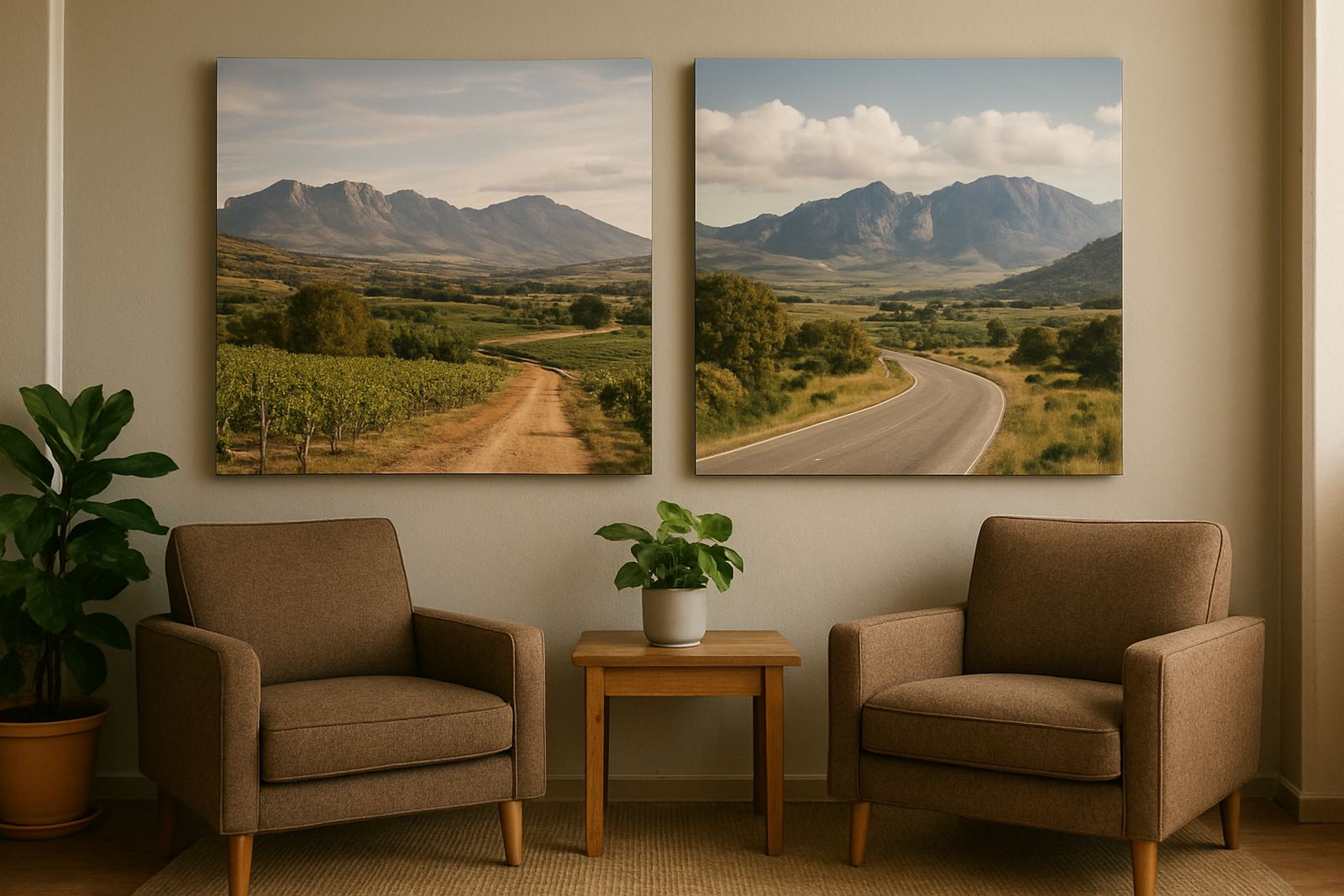
Why reception walls benefit from canvas
A reception area has to do a few jobs at once. It must greet people, reflect the business and keep them comfortable while they wait. Bare walls can feel cold, while glossy posters or loose frames often pick up glare, fingerprints and reflections from bright windows. Canvas prints sit neatly in between. They bring warmth to the room, absorb a bit of the hard light and give you a cleaner finish than paper on board.
For waiting rooms in Paarl, Wellington and nearby towns, this matters more than many people think. Morning sun through a front window, afternoon heat and the dust that comes with open doors can all make a wall display look tired quickly. Canvas holds up well in these conditions when it is printed and stretched properly, and it does not need heavy framing to look complete.
- They suit offices, guest houses, medical rooms and showrooms.
- They work well on large empty walls above seating areas.
- They soften concrete, drywall and tiled spaces without clutter.
- They can be matched to a brand colour palette or local theme.
Choosing the right image for the room
The picture you choose matters as much as the print itself. A reception wall should not shout at people as they walk in. It should support the room and make sense for the business. In many cases, this means using calm local scenes, simple brand artwork or a set of related images rather than one oversized image with too much detail.
For a law office or medical practice, a clean landscape, line art or a softly coloured brand graphic usually works best. A guest house may want vineyard views, mountain ridges or a tasteful set of heritage images from the area. A workshop, sign company or motor trade business might use one strong image that shows the work being done, but it still needs breathing room around it.
- Choose images with good resolution so faces, text and fine details stay sharp.
- Use colours that repeat in cushions, counters, brochures or uniforms.
- Avoid busy collages if the room already has strong patterns or signage.
- Think about what clients see from the waiting chairs, not just from the entrance.
A useful rule is to keep the image easy to understand from three to five metres away. If people must stand right in front of it to work out what they are looking at, it is probably too fussy for a reception wall.
Size, placement and sightlines that feel natural
Canvas looks best when it is placed with the room in mind, not only the wall. A small print on a long wall can look lost, while an oversized piece squeezed between windows can make the room feel cramped. Measure the wall width, check where chairs, counters and doors sit, then leave some space around the print so it can breathe.
In a narrow waiting area, one long horizontal canvas often works better than several small pieces. In a larger lobby, a grouped set can help balance the room and fill a blank wall without making it feel heavy. If the reception counter sits opposite the main wall, make sure the print is level with the natural eye line from the seated area, not only from standing height.
- Single canvas pieces suit compact offices and clean minimalist spaces.
- Two or three panels can help stretch a wide wall.
- Leave room for notice boards, directories and branded leaflets.
- Keep key artwork away from direct contact with door handles and queues.
For a Wellington business with a bright front window, placing the canvas on the side wall may work better than directly opposite the glass. That keeps the image visible without too much glare or heat exposure.
Finish choices that suit local conditions
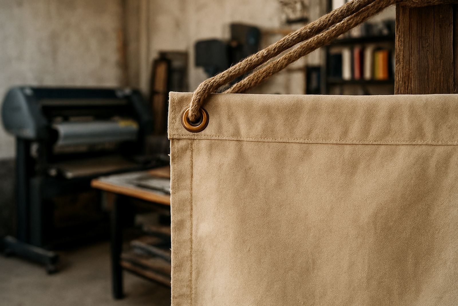
Canvas in reception needs more than a nice picture. The material, stretching and edge finish all affect how long it will look good. In the Boland, many interiors deal with sunlight, dust and occasional humidity from cleaning or nearby kitchens. A well stretched canvas with crisp corners and a tidy wrap edge handles this better than a cheap print that sags after a few weeks.
Matte surfaces are often preferred because they reduce glare. This is useful in offices with downlights, glass doors or east facing windows. If the reception is in a busy public space, a protective finish can also make cleaning easier. The print should be mounted straight, with even tension across the frame so it does not ripple. That part sounds simple, but it is where many poor prints show up.
- Matte finishes are easier on the eye in bright rooms.
- Stretched canvas gives a cleaner look than loose mounting.
- Wrapped edges work well when the image can continue around the sides.
- Protective finishing helps with light dusting and general care.
In coastal or semi coastal settings, a reception print should be checked for long term exposure to moisture and sun. Even inland, a wall close to a kettle station or entrance can change over time. Good placement and proper finishing reduce the risk of warping or fading.
How canvas helps hospitality spaces feel calmer
Guest houses, tasting rooms, cafés and small hotels rely on first impressions. People arrive with luggage, children or a long drive behind them. A reception area that feels too bare can add to the sense of waiting. Canvas helps by giving the space a softer visual rhythm. It can carry a local story too, which matters in places where visitors want to feel they are somewhere specific, not in any generic room.
A well chosen canvas might show vineyard rows near Paarl, mountain shapes around Franschhoek or a simple botanical theme that reflects the building’s style. When done properly, the print feels like part of the interior rather than an item added at the last minute. It also pairs well with wood, stone, metal and neutral paint colours, which are common in hospitality fit outs.
One guest house in Paarl, for example, used two large canvas pieces in the reception lounge: one with a soft Boland landscape and another with a clean typographic artwork naming nearby towns. The room felt more settled immediately, and the owners said guests stopped asking whether they had come to the right place. That kind of clarity matters when people arrive tired and unsure.
Artwork checks and installation make the difference
Canvas is only as good as the file and the fit. Before printing, artwork should be checked for sharpness, crop lines, spelling and colour balance. If the image includes small text, that text must still read clearly from the waiting area. Any borders, brand marks or location names should be tested against the wall size before production starts.
Installation also matters. A canvas that hangs slightly off level will catch the eye for the wrong reason. It should sit securely on the wall, especially in public areas where people move past chairs, doors and counters. In a reception with regular cleaning or foot traffic, the fixing must be solid and neat. That saves rework later and keeps the room looking cared for.
- Check image resolution before printing.
- Confirm the final size against the wall and furniture layout.
- Allow enough margin for stretching and wrapping.
- Make sure the fixing suits the wall type, whether brick, drywall or plaster.
For businesses in Paarl, Wellington, Stellenbosch, Franschhoek, Worcester and Malmesbury, that practical approach is usually the best one. It keeps the job simple, the room tidy and the result useful for years.
A local look that still feels professional
Canvas in reception works best when it feels grounded in the area and honest about the business. It does not need to be loud to be noticed. A calm image, good sizing and proper finishing can make a waiting room feel more comfortable straight away. That is why so many offices and hospitality spaces now use canvas as part of the interior rather than as an afterthought.
At Catprints and Signs in Paarl, canvas prints are made for the way local businesses actually use their spaces. Whether the room needs a single statement piece or a small set of matching prints, the aim is the same: make the waiting area easier on the eye and more welcoming for every visitor.