Why the same colour does not behave the same way
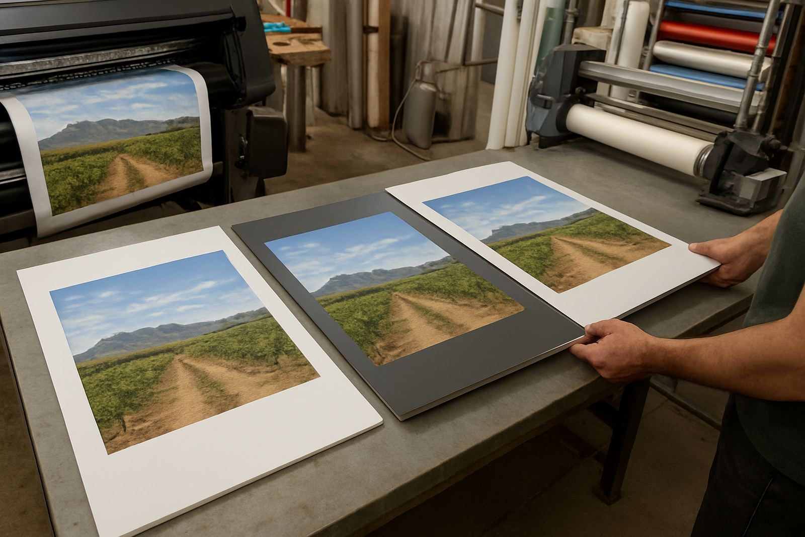
Colour is not only about the artwork file. It is also about the surface it lands on, the ink or print method used, and how much light the material bounces back. A white flyer on smooth coated paper can hold fine detail and strong contrast. That same white on clear vinyl, grey board or a textured banner can look softer or less sharp because the base material changes how the colour sits.
In practical terms, paper absorbs differently to vinyl, and board can have its own coating or texture. If you have ever printed the same logo for a counter card and a shop window, then wondered why the blue feels deeper on one and lighter on the other, that is normal. It is not a fault in the artwork. It is the material doing what it does best.
Paper is for detail, reading and short-run colour control
Paper is still the first choice for business cards, flyers, menus and brochures because it gives good detail and a clean finish. For small text, fine lines and photographs, coated paper usually gives the most even result. Uncoated paper feels warmer and easier to write on, but colours can look a little softer, especially reds and dark blues.
When we check artwork for print, we look at things like photo quality, safe margins and whether the colour will stay readable once trimmed. If a flyer is meant for a Paarl launch table or a Wellington showroom counter, the light in the room matters too. Strong sunlight through a window can wash out pale colours, so we often suggest stronger contrast and bolder type.
- Best for business cards, leaflets and event handouts
- Works well for detailed artwork and photos
- Good when you want a sharp finish at a lower cost per item
Vinyl changes the look because it is built for sticking, not soaking
Vinyl is the right choice for stickers, decals, wraps and window graphics because it grips to a surface and handles weather better than paper. But vinyl is not paper. Gloss vinyl can make colours feel brighter and a bit more punchy, while matte vinyl softens reflections and can make dark shades look calmer. On clear vinyl, the background behind the print becomes part of the final colour story.
This matters on vehicles and shop windows. A white logo on clear vinyl over dark paint will not look the same as the same logo on a white panel. On a motorbike fairing in the Boland sun, a glossy red can appear stronger at midday and deeper in shade. If the vehicle is used near the coast or parked outside most of the day, we also think about UV fade and whether the finish needs lamination for extra protection. Small detail, big differance.
- Best for stickers, wraps, frosted window film and magnets
- Can be gloss, matte, clear or block-out depending on use
- Needs correct application for long life in heat and dust
Board needs the right print and the right backing
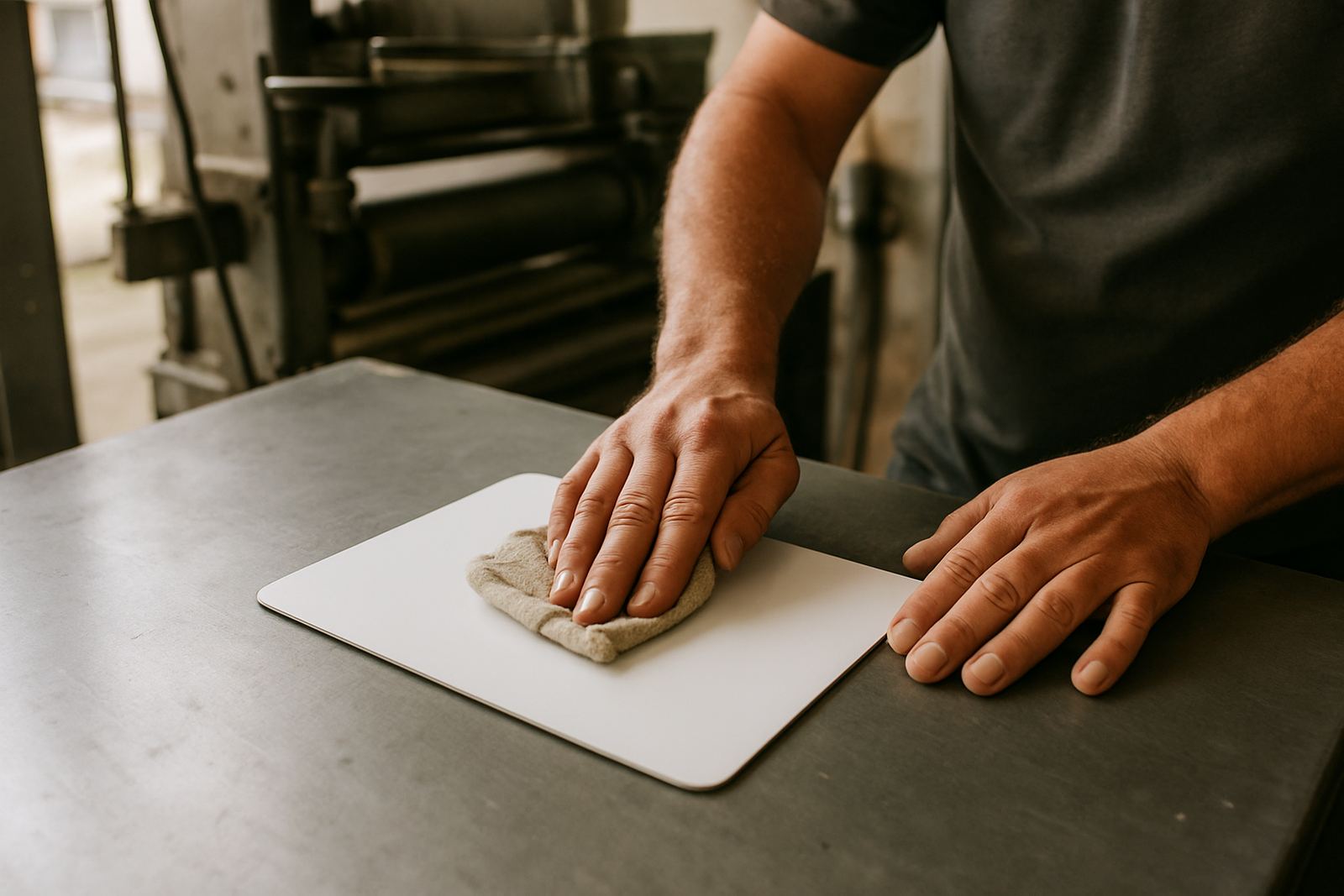
Board is often used for safety signs, menu boards, directional signs, site notices and indoor displays. It can be foam board, PVC board, aluminium composite or another rigid sheet. Each one responds differently. A smooth white board gives crisp colour, while a textured or coloured board can mute some shades. If the board is mounted outdoors, the edge finish and fixing method matter as much as the print.
For a sign outside a workshop in Worcester or a farm entrance near Simondium, we will think about wind, sun and water exposure. A board that looks perfect indoors can warp or fade early if it is not suited to the job. That is why we do board mounting and sign installation carefully, rather than treating every sign the same.
- Good for safety signs, site boards and branded displays
- Can be mounted for a cleaner, stiffer finish
- Outdoor use needs weather-aware material choice
How light and location change what your eye sees
The Boland has strong light. That is useful for shopfronts and vehicles, but it also changes how colours read during the day. A green that looks balanced indoors can look brighter at noon in Franschhoek. A black logo on a sunny white wall can appear softer than it did in the studio. Coastal humidity closer to the west can also affect how long certain materials stay fresh if they are left outside with no protection.
Load-shedding adds another layer. If a business is checking samples under different lights, the shade can shift depending on whether the room is using natural light, low LED light or emergency lighting. That is why we always advise clients to compare samples in more than one place if colour accuracy matters. A good sample in the hand beats guessing from a screen every time.
- Check samples in daylight and indoor light
- Use stronger contrast for outdoor signs
- Ask whether the item will live in sun, shade or behind glass
A Paarl example: one logo, three very different jobs
Take a local plumbing company in Paarl. They may want the same logo on business cards, a vehicle wrap and a safety sign for a job site. The card needs fine detail, clear contact space and a neat finish. The wrap must read from a distance, hold its colour on curved panels and stand up to daily use. The safety sign needs quick readability, strong contrast and a material that can handle dust, rain and sun.
Same logo, three jobs, three different material choices. If the blue is perfect on the business card, it may still need adjusting for the vehicle panel so it does not disappear in bright light. That is where artwork checks and proper print setup help. We would rather catch those changes before production than hand over something that looks right only on the screen.
How to brief your printer so the colour lands right
If you want the finished item to match the job, tell us where it will be used and what it must do. A poster for inside a shop is not the same as a vinyl sticker for a delivery bike. Let us know if the surface will be glass, paint, board or metal, and whether the item will face direct sun, rain, or regular cleaning. Those details help us choose the right print method and finish.
For businesses across Paarl, Wellington, Stellenbosch, Franschhoek, Worcester and Malmesbury, that simple briefing saves time and reprints. It also helps with updates later, because we can match the earlier job more closely when the colour needs to stay consistent across branches or vehicles.
- Say where the item will be used
- Tell us if it must be seen up close or from the road
- Ask for artwork checks before print if the job is important