
Start With the First View From the Door
A reception area does not need every wall covered to make an impression. What matters first is the line of sight from the entrance, because that is where clients decide if the space feels organised, professional and easy to read. A clean wall sign behind the counter, a neat logo on glass and one or two framed or mounted visuals are often enough.
For offices in Paarl and Wellington, the best reception branding ideas usually begin with the size of the room. A small foyer can feel cramped if every surface is busy. A larger reception can carry more detail, but even then it is better to keep the main message simple. Your name, logo, and a short line about what you do can carry a lot of weight without shouting.
A practical note for Boland businesses is light. Strong afternoon sun, reflective glass and load shedding can all affect how branding reads in the room. Matte finishes help reduce glare, while frosted film can soften harsh light and still keep the space private. That matters in medical rooms, legal offices, estate agencies and workshop front counters alike.
Wall Signs That Give the Reception Its Anchor
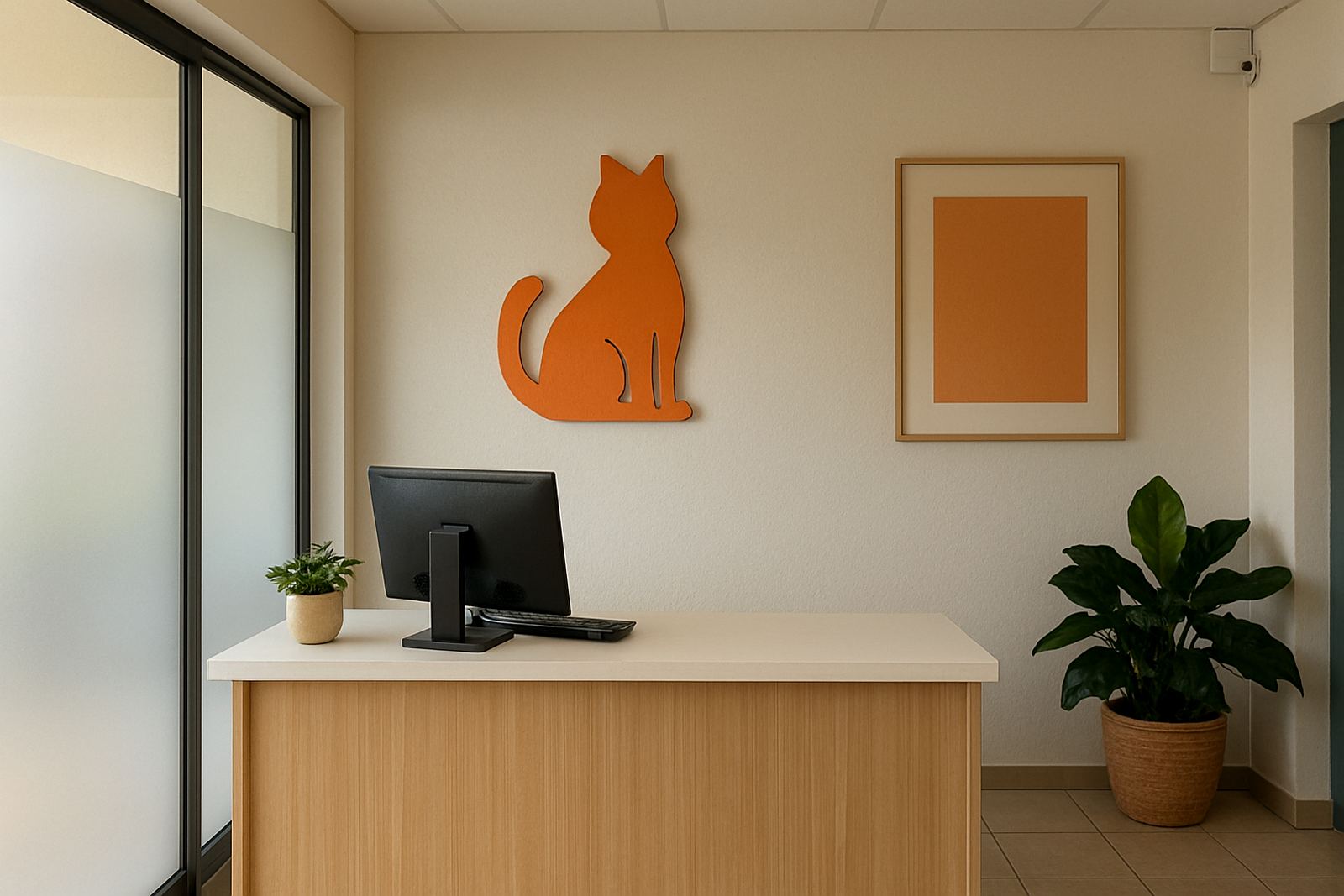
A wall sign is usually the anchor piece. It tells visitors they have arrived at the correct place and gives the room a centre point. Acrylic lettering, cut vinyl on a smooth panel, aluminium composite boards and standoff mounted signs all work well, depending on the look you want and the space you have.
If your reception is small, keep the sign slightly above eye level so the counter area stays open. If your ceiling is high, a wider sign can help balance the room. For many Paarl businesses, the smart move is a sign that is large enough to read from the doorway but not so big that it dominates the whole room.
- Use a single main logo wall behind the reception counter
- Match the sign colour to your existing interior finishes
- Choose a finish that handles cleaning well in a busy office
- Leave space around the sign so the wall can breathe
When the wall surface is not ideal, a mounted board can solve the problem neatly. It is also easier to remove or update later if contact details or wording changes. That is useful for growing businesses that refresh branding every few years, or after a renovation.
Canvas Prints and Feature Panels for a Softer Look
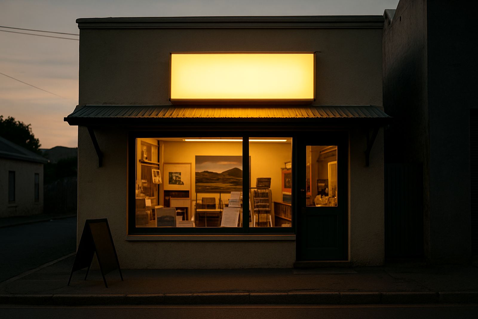
Canvas prints suit reception areas that need warmth rather than hard edges. They work well in hospitality, property, wellness and creative spaces, but they also fit offices that want a friendlier feel. A canvas can carry a local landscape, a brand story image or a simple design using your colours and shapes.
In a Boland reception, a canvas can help the room feel grounded. Think of a Paarl view, vineyard tones, mountain lines or a simple abstract piece that matches your interior palette. The important part is that the image should support the room, not fight with the signage. One strong canvas is usually better than three small ones.
For reception areas with echo or a lot of hard surfaces, a canvas also softens the space visually. It will not replace proper acoustic treatment, but it can make the room feel less stark. That small change can make a real difference when clients wait for quotes, permits or appointments.
- Use one large canvas instead of many small framed prints
- Keep colours aligned with your sign and counter finishes
- Choose images that suit the business and the area
- Mount at a height that is easy to view from seated positions
Frosting for Privacy Without Making the Room Feel Closed In
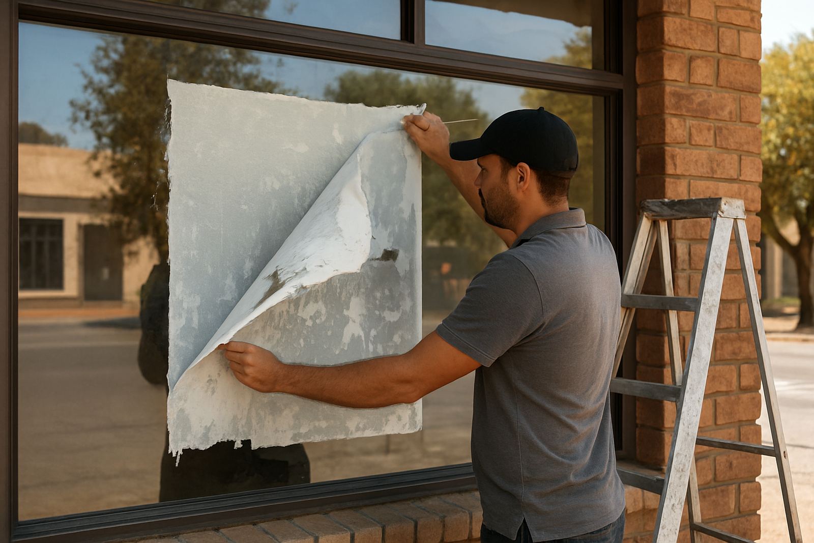
Window frosting is one of the most useful reception branding ideas because it does two jobs at once. It adds privacy and it adds branding. Frosted film can cover part of a glass wall, a front door or a meeting room panel while still allowing daylight to pass through.
In reception areas facing busy streets or shared parking, frosting helps reduce distractions. It can also keep sensitive spaces private while still letting the receptionist see who is arriving. For businesses in Stellenbosch, Franschhoek and Malmesbury, where glass fronts are common in retail and office parks, this is a practical choice that looks tidy all year round.
Simple bands, logos, opening hours or a repeating pattern are often enough. You do not need to cover every pane. In fact, partial frosting often looks better because it keeps the room light. In coastal humidity or in spaces that get cleaned often, the film should be applied properly and the glass should be prepared well, otherwise edges can lift over time.
Frosting is also useful where municipal or building rules limit what can be fixed outside. If exterior signage is restricted, interior glass branding can carry part of the load and still keep the front area presentable.
How to Combine the Pieces So the Room Feels Planned
The strongest reception branding usually combines three layers: one main wall sign, one softer feature element and one glass treatment. That can be a logo wall, a canvas to the side and frosting on the entrance glass. Together they create a complete look without overcrowding the room.
Before ordering anything, think about how the space is used during the day. Where do clients stand first? Where do they wait? Which wall is seen from the entrance? These questions matter more than style trends. A good layout guides movement and gives the receptionist a clear backdrop for greeting visitors.
A local example: a Paarl contractor office with a narrow reception and a glass front can use a cut vinyl logo on the main wall, a clean frosted band across the front panes and one canvas showing project work or a simple brand image. That setup feels tidy, gives privacy and is easy to maintain when dust from road traffic builds up.
For businesses that handle frequent updates, reprints and changes in staff or services, it helps to keep the design modular. That way one panel can be changed without redoing the whole room. It saves time and Rand, especially when the reception still needs to stay open during business hours.
What to Brief Your Sign Maker Before You Order
Good reception branding starts with a clear brief. The more practical detail you give, the better the result. A sign maker needs room sizes, wall measurements, glass sizes, brand colours, logo files and a sense of the mood you want. Even a rough sketch or photo of the space helps.
It also helps to mention the conditions in the room. Is the area air-conditioned? Does the sun hit the glass in the afternoon? Is the wall painted, tiled or uneven? These details affect material choice and installation. In a busy business park or a reception that gets many visitors, durability matters just as much as appearance.
- Measure wall width, height and glass panel sizes before you brief
- Share any branding rules, colour references or logo variations
- Explain how much privacy you want from the frosting
- Say whether the reception needs a formal, friendly or modern feel
- Ask about maintenance so cleaning does not damage the finish
For businesses across Paarl, Wellington and the wider Boland, a well planned reception can do a lot of quiet work. It sets the tone, keeps the area orderly and makes the first greeting easier. That is the real value of good branding: it helps the space speak for itself.