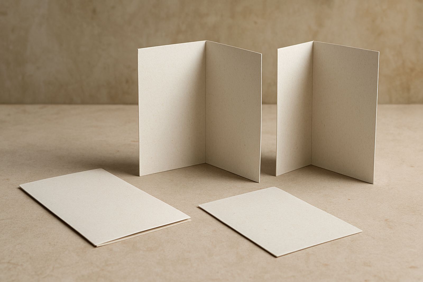
Why the fold matters before the print run starts
Brochures are not all read in the same way. Some need a quick front to back scan for price lists or service summaries, while others need room for step by step detail, maps, product ranges or a booking form. The fold you choose controls the order people see the pages and also affects how your content sits once the brochure is trimmed and folded.
In practice, the fold choice affects paper size, artwork setup and finishing time. It also affects how the brochure feels in the hand. A short folded leaflet can work well at a till point in Paarl, while a more detailed multi panel brochure suits a winery tasting room in Franschhoek or a contractor handing out service details in Wellington.
Common brochure folds and what each one does best
There are a few standard fold styles that work well for local business printing. Each one suits a different amount of content and a different reading path. If you want people to open, scan and remember your message, it helps to match the fold to the purpose instead of choosing one just because it looks neat.
- Half fold: One sheet folded once to make four panels. Good for simple price sheets, menus and service overviews.
- Tri fold: Six panels, folded into thirds. Useful when you need a clear start, middle and end for promotions, product introductions or event details.
- Z fold: Also six panels, but it opens like a zig zag. Handy for step by step instructions, maps or timelines because each panel is easy to reveal in order.
- Gate fold: Two outer panels open toward the centre. Works well for premium presentations, launches and feature products where the reveal matters.
- Accordion fold: A long fold that opens panel by panel. A good choice for tours, routes, ranges or multi location information.
How to match fold type to your message length
If your message is short, do not force it into a brochure with too many panels. Empty space can look fine, but if the content is too thin the print job may not justify the fold. A half fold can be enough for a compact price list or safety notice. A tri fold gives more room without becoming fiddly.
When you have a lot to say, the reading path matters even more. A folded brochure should guide the eye from headline to detail to action. That is why an accordion or gate fold may work better for a product range, equipment list, or a business profile that needs room for testimonials and contact details. For a building supplier in Worcester, for example, a six panel brochure can separate product groups by panel so customers are not hunting for the right section.
- Use fewer panels for short messages and quick handouts.
- Use more panels when you need sections, charts or multiple offers.
- Keep the call to action in a visible spot, usually the final panel or back panel.
Paper, folds and finishing choices that hold up in Boland conditions
Paper choice matters just as much as the fold. Lighter paper is easier to fold neatly, but heavier stock can feel more substantial. For a brochure that will be handled often at a showroom, guest house or counter, lamination may help protect the edges. In coastal humidity or dusty work sites, this can make a real difference.
It is also worth thinking about how the brochure will behave once folded. Thick artwork near the fold line can crack if the stock is too heavy and there is no proper score. A good print setup keeps images away from the crease where needed and allows for trimming so the panels close properly. On jobs with photos or dark blocks of colour, a clean finish matters because poor folding shows up fast.
- Choose lighter stock for simple handouts and higher volumes.
- Choose heavier stock for presentations and repeated handling.
- Ask for scoring on thicker brochures to reduce cracking at the fold.
Design mistakes that make folded brochures hard to use
One common mistake is packing too much copy into every panel. Another is placing key details too close to the fold so they disappear when the brochure is opened or closed. Small text can also become difficult to read once the panel is creased, especially if the brochure is being used outdoors or in low light.
Image placement needs attention too. Photos that span across the fold can look awkward if the artwork is not set up correctly. The order of the panels should make sense when someone opens the brochure in their hands, not just on the screen. If you are promoting a vehicle service, for example, you may want the front panel to carry the main offer, then the inside panels to explain fitment, decals, magnets or wraps before ending with the enquiry details.
- Avoid tiny text near fold lines.
- Do not place important pricing where it may be lost in the crease.
- Check the panel order before print, not after.
A local example from Paarl to Wellington
Imagine a Boland business that supplies window frosting, safety signs and vehicle graphics across Paarl, Wellington and Stellenbosch. A simple half fold brochure could work for a trade counter handout, but if the business also wants to explain contra-vision, magnets and full wraps, a tri fold or accordion fold gives enough room to separate each service properly.
For a farmer’s market in Franschhoek or a motorbike event in Malmesbury, the reading path matters as much as the design. People may only have a few seconds while walking past. In that case, the front panel should carry the strongest message, the centre panels should show the service range, and the back panel should hold the contact prompt and location details. That way the brochure still works even if it gets folded back into a pocket or bag.
We often see a better result when the fold follows the decision path of the customer. First they notice the offer, then they learn what is included, then they decide whether to enquire. That is a small thing, but it can make a brochure more useful in real business settings.