
Start with one job for each poster
The quickest way to waste window space is to ask one poster to do everything. A poster that must advertise a special, explain trading hours, share a price and push a brand message usually ends up crowded and hard to read. Pick one job per poster and decide what the customer must understand in three seconds or less.
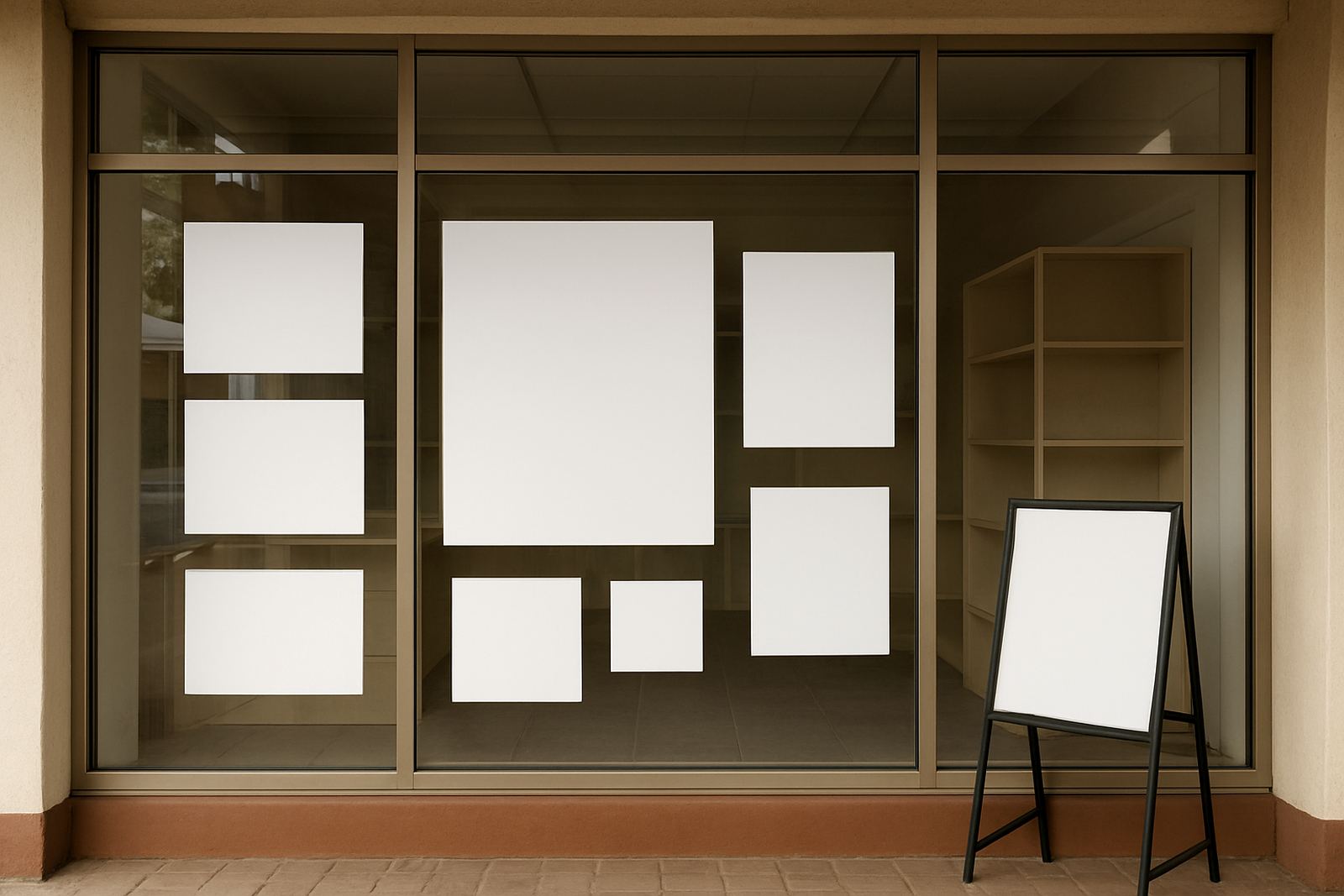
For a small shop in Paarl or Wellington, that might mean one poster for a weekly special, one for a service list and one for trading hours. If the window is narrow, use a vertical layout. If the glass is wide but the wall space beside it is limited, use a long horizontal strip. Simple planning saves money on reprints and keeps the front looking orderly.
- One message per poster keeps the design clear
- Use fewer words for faster reading from the pavement
- Choose vertical or horizontal layout to suit the glass
- Leave space around the main message so it does not feel cramped
Think about viewing distance before size
Most window posters are read by people walking past, pulling into a parking bay or waiting at a robot. That means your text must work at street level, not just close-up. A poster that looks fine on a counter can disappear once it is stuck high on glass and seen through reflections. Size should be based on the farthest likely viewing point.
For busy streets in Stellenbosch or along main roads in Worcester, larger lettering and a stronger contrast are usually safer. In a quieter side street, you can use a slightly smaller format, but only if the window is close to eye level. As a general guide, the main headline should be the largest item, followed by the offer or service, then any small print such as dates or terms.
- Big headline first, then supporting detail
- Dark text on light backgrounds is easier to read in glare
- Avoid thin fonts that disappear behind reflections
- Keep the bottom line simple because shoppers rarely stop to read small print
Use windows to solve space problems
Some shops have almost no wall space at all. A hair salon, takeaway counter or small retail store may need the walls for shelves, mirrors or fittings. In that case the window becomes the main advertising surface. A well placed poster can show opening specials, tell people what services are available, or point them toward the entrance.
Poster placement matters just as much as the artwork. If the window faces strong afternoon sun, the lower half may be easier to read than the upper half. If the glass is filled with product displays, place the poster in the clearest open panel. When there is only a narrow strip of glass available, a stacked layout can still work if the wording is short and the image is strong.
- Use the cleanest section of glass first
- Keep posters away from handles, frames and stickers that create clutter
- Use shorter wording when the available panel is small
- Place the strongest offer at eye level where people naturally look
Match the poster to the type of shop
Different businesses need different kinds of posters. A clothing store may need seasonal promotions and new arrivals. A spaza shop may need price-led specials and opening times. A workshop or tyre fitment centre may need a simple service list with clear contact points. The best window poster ideas are practical, not decorative for the sake of it.
For example, a café in Franschhoek might use one poster to promote breakfast until 11 am and another to show takeaway coffee. A hardware shop in Malmesbury may need a poster for winter stock and another for trade accounts. When the message fits the business, the poster feels helpful rather than pushy. That is often what gets a customer to walk in.
- Retail shops benefit from price and product posters
- Service businesses need clear lists and opening hours
- Food outlets should show quick decisions like specials or combo offers
- Trade counters do better with direct, practical wording
Plan for sun, humidity and cleaning
Window posters in the Boland take a fair amount of punishment. Summer heat, dust, coastal moisture in some areas and regular glass cleaning can all affect how long a poster stays neat. If the poster is going to live on the window for weeks, choose materials and finishing that suit the location. A poster that curls, fades or lifts at the edges sends the wrong signal.
Lamination can help with cleaning and handling, especially where fingerprints are common. In humid conditions or in a shop that gets regular mopping and spray cleaning, the edges need to stay flat. If the poster is temporary, make sure it is easy to replace without leaving residue. A tidy window is part of the shopfront, not an afterthought.
- Use finishes that cope with sunlight and daily wiping
- Replace weathered posters before they look tired
- Keep a set of current posters ready for seasonal changes
- Choose materials that remove cleanly when a special ends
A simple Paarl example that works
Take a small retail shop in central Paarl with one narrow front window and a glass door. There is no room for a large wall display, and the owner wants to advertise a weekend special without blocking light into the shop. The answer is not one oversized poster crammed with text. It is a small set of clear messages arranged by priority.
One panel can carry the special, another can show the shop hours, and a third can list the main product category. If the shop gets afternoon glare, the most important line should sit in the least reflective part of the glass. This setup works just as well for a barber, a phone repair shop or a supplier with a front counter. It keeps the front honest, easy to read and simple to update.
When we plan window posters for businesses across Paarl, Wellington and the wider Boland, the first question is always the same: what must a person understand before they reach the door? Once that is clear, the rest becomes easier to space, size and print.